#1933 closed enhancement (fixed)
Make bbPress responsive
| Reported by: |
|
Owned by: |
|
|---|---|---|---|
| Milestone: | 2.4 | Priority: | normal |
| Severity: | normal | Version: | 2.1.2 |
| Component: | Appearance - Theme Compatibility | Keywords: | has-patch |
| Cc: | mercijavier@…, vpundir@…, jared@…, stephen@…, e.soghe@…, navjotjsingh@…, wordpress@…, pippin@…, trishasalas, nashwan.doaqan@… |
Description
I was testing bbPress out on a responsive theme and saw that bbPress doesn't format properly when viewed on mobile device.
I was also wondering if it was best to use tables at all.
This ticket is to see if we can improve bbPress for on mobile devices.
Attachments (17)
Change History (47)
#2
 @
@
12 years ago
- Milestone changed from Awaiting Review to 2.2
bbPress is kind of responsive, though it could be more-so. This is a great opportunity for someone to come in and do some amazing CSS work.
#4
follow-up:
↓ 6
 @
@
12 years ago
- Cc mercijavier@… added
JJJ I'd like to try :-) Add styles in bbpress.css and bbpress-rtl.css files or in new bbp-responsive.css and bbp-responsive-rtl.css?
#6
in reply to:
↑ 4
@
12 years ago
Replying to mercime:
JJJ I'd like to try :-) Add styles in bbpress.css and bbpress-rtl.css files or in new bbp-responsive.css and bbp-responsive-rtl.css?
Adding to existing .css files is perfect.
#7
@
12 years ago
- Milestone changed from 2.2 to Future Release
Moving to Future Release milestone, so we can focus on getting 2.2 out and iterate on this later.
#8
follow-up:
↓ 9
 @
@
12 years ago
We've done it on several responsive designs... when you are ready, I can help.
Issue of tables becomes very relevant at screen width of <= 480px ... they really have to be hacked away to squeeze everything in. See eg. our Responsive LabZip demo: http://labsecrets.com/demo/responsive/forums/
#9
in reply to:
↑ 8
 @
@
12 years ago
Replying to labsecrets:
We've done it on several responsive designs... when you are ready, I can help.
Issue of tables becomes very relevant at screen width of <= 480px ... they really have to be hacked away to squeeze everything in. See eg. our Responsive LabZip demo: http://labsecrets.com/demo/responsive/forums/
if the size of the width of the page is below 480 px then hide with css Posts column for example...
#11
 @
@
12 years ago
- Cc jared@… added
Overall bbPress is responsive. I can shrink it down to 500px and it's fine assuming your theme bumps/hides the sidebar. Even at a smaller size the only thing that "breaks" is the ' Add this topic to your favorites (?) | Subscribe' bumps to 2 lines.
I guess we could tweak the column sizes on the topic/forum listings for mobile devices. Also we could change the sizing for posts (see attached).
Are we talking just a few small tweaks like that? If so I could take this one on.
#13
 @
@
12 years ago
- Cc e.soghe@… added
I made some recommendations to the Balance theme that probably applies better to bbPress core. Briefly put I think the buttons need to be merged into one item, e.g. like #1652, and most importantly the profile elements should be shown in a horizontal column above the post content, not besides it, and without an avatar.
http://community.presscrew.com/topic/suggested-tweaks-to-improve-forum-display-on-smaller-screens/
Furthermore, made evident by a forum user's screenshots below, it would also be useful if bbPress could take better advantage of the max space that it's given, maybe by setting it in a "full-width" display mode or something, where it doesn't apply it's own set of borders, but simply stretches to the edges of the section it's been put in.
http://jmonkeyengine.org/forum/topic/theme-updated-sorting-out-some-bugs/#post-200385
#15
@
12 years ago
- Keywords has-patch added
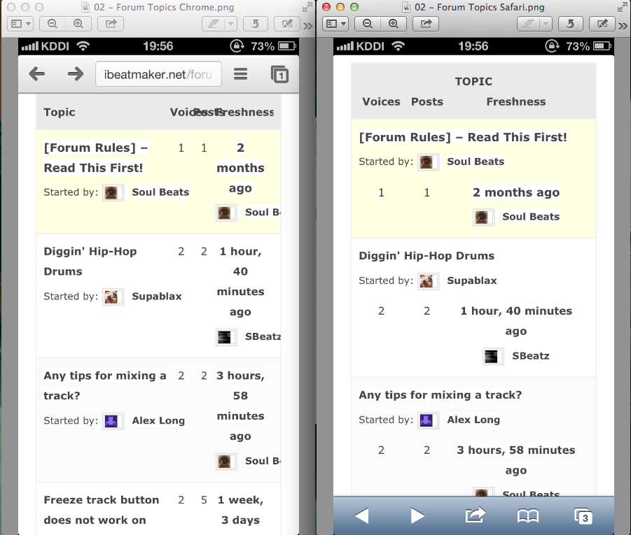
WordPress 3.6 trunk and bbPress 2.3 trunk. Used BuddyPress 1.7 trunk to test with BP Default theme
Screenshots and patch attached.
Screen resolution breakpoints:
- 480px
- 320px
- 240px
bbPress pages tested with patch (screenshots attached):
- Forums Directory page
- Single Forum's Topics page
- Single Topic Page
- User Profile Page
Browser/devices tested with patch:
- Firefox
- Chrome
- Safari
- IE 8/9
- Opera
- iPhone
- iPad
- Blackberry
- Nokia
- Nook
- Kindle Fire /HD
- Android Tablet
Themes tested (default settings):
- Twenty Twelve
- Twenty Eleven
- BuddyPress Default Theme
Notes:
- Feedback of any issue along with screenshot/s and OS/Browser versions used is welcome.
- Need to test the corresponding RTL styles added.
- Needed one HTML structure change in bbPress template for mobile-friendly styles down to 240px. Removed <br /> from 'sep' => '<br />' to 'sep' => ' ' out of bbp_reply_author_link in bbpress/loop-single-reply.php
First pass at improving responsive bbPress style in smaller screen resolutions.
#18
 @
@
12 years ago
would like for the feature of uploading avatars, because other plugins for uploading avatars in the front-end, are not responsive plus it makes the bbpress profile look more awesome :D
#19
 @
@
12 years ago
Hi mercime,
I have created Ticket #2170, but it has been closed as a duplicate. I was redirected to this ticket, and found your patch 2. I have amended all three files (loop-single-reply.php file, bbpress.css and bbpress-rtl.css file) as instructed in your patch. I have confirmed that the layout has successfully become responsive on Safari on iPhone 5. (Layout shows exactly like your 320px layout). However, when I viewed the same website from Google Chrome on iPhone, the layout was not responsive.
Can you advise how to make the layout responsive on Chrome as well?
Please see attached screenshots.
iOS Version: 6.1.3
Chrome Version: 25.0.1364.124
#21
 @
@
12 years ago
Just tested out the patch and it's looking really good. I'd like to see the reply controls cleaned up a little more: http://d.pr/i/ss99
#22
@
12 years ago
Note: There is an alternative to removing <br /> from 'sep' => '<br />' from bbp_reply_author_link in bbpress/loop-single-reply.php. One would need to surround the following
<?php do_action( 'bbp_theme_after_reply_author_admin_details' ); ?>
with a div which would be positioned absolutely (bec. there's a br after the avatar), then use JS to expand relatively positioned div.bbp-reply-author (which contains the avatar and new absolutely positioned div) vertically as needed - e.g. star ratings or other community tags added by plugin/s.
@funnycat777 Thanks so much for the screenshots and info. I had expected possible issues from smartphone/s not tested, didn't expect that from Chrome in iOS 6 :-) Initial research shows resolution by using conditional isiOS()&& isChrome() and offering a different stylesheet or by changing meta viewport content in <head> to contain "initial-scale = 1.0"
For example, in Twenty Twelve theme change
<meta name="viewport" content="width=device-width" />
to (added limitations)
<meta name="viewport" content="width=device-width, user-scalable=no, initial-scale=1.0, minimum-scale=1.0, maximum-scale=1.0" />
EDIT - There's also another possible solution with regards to adding orientation but it didn't work out for me when I tested it. Still, will look into this further for CSS-only solution.
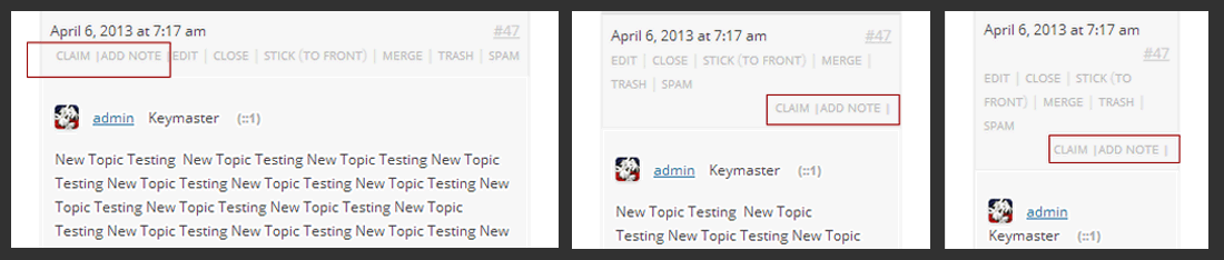
@mordauk Thank you for your feedback. I assume that the "Add Note" and "Claim" links were added by a plugin or manually. Based on the image, I can only also assume that the "Add Note" and "Claim" links are aligned left and in respective lines because those new links were each surrounded by same span class used in surrounding the other default links which has float: left; and clear: left set at 480px screen width.
Do you have something like the following in source?
<span class="bbp-admin-links"><a href="http://something">Edit</a> | <a href="http://something">Move</a> | <a href="http://something">Split</a> | <a title="Move this item to the Trash" href="http://something">Trash</a> | <a href="http://something">Spam</a></span>
<span class="bbp-admin-links"><a href="http://something">Add Note |</a></span>
<span class="bbp-admin-links"><a href="http://something">Claim |</a></span>
One could remove the float and clear styles added via media query for span.bbp-admin-link but the result is shown below for 480, 320 and 240 of "Add Note" and "Claim" links as seen in Chrome if the HTML structure is how I assumed it to be:
https://bbpress.trac.wordpress.org/attachment/ticket/1933/addnote-claim-links.png"
A solution would be to remove the span.bbp-admin-links surrounding "Add Note" and "Claim" links and then insert those links in the original span containing the admin links by filtering bbp_get_topic_admin_links or bbp_get_admin_link, I think.
#23
 @
@
12 years ago
- Cc trishasalas added
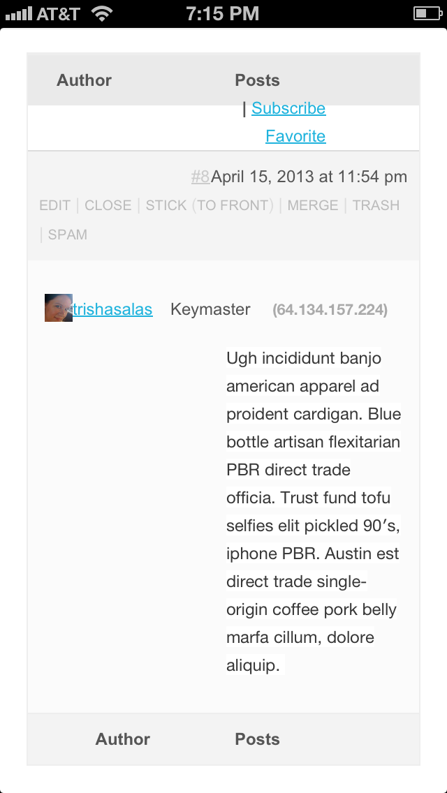
@mercime, svn is new to me so apologies in advance if I missed something in the patch (I tried to be thorough)
I'm attaching 2 screenshots, both ios6 and chrome...portrait and landscape.
BuddyPress default theme, BuddyPress 1.7, bbPress 2.3, WordPress 3.5.2
#24
 @
@
11 years ago
I just wanted to check - is this still moving along? I've worked hard to make my site as responsive as possible - but I'm still struggling with the comment box on the forums. Will this patch help that?
#25
follow-up:
↓ 26
 @
@
11 years ago
With all due respect, I think the approach of modifying the existing CSS is wrong for this.
I've had to do a lot of tweaking of these same files to cram bbPress into the Pinboard theme, and it's inelegant to do it that way even though I eventually hammered it all out. (My site is http://www.itinerantangler.com/blog/board/forums/).
I think you need to give up on the idea of cramming all the same data into the mobile version and focus on the critical info. This is what other sites like Vanilla (which has an awesome mobile version) have done.
We don't need a topic count, or a post count, on mobile. We really just need the titles and the authors and maybe the freshness. Eliminating those two columns altogether from the layout will free up a lot of space to accomplish what needs doing.
When you get to the individual posts, the avatar should lay out on top with the topic or reply title, then below that you should get the whole comment.
It would also be nice if there was an entirely separate CSS scheme for mobile, such that the borders and edges of the forum created for the main site didn't even display. I guess my bottom line is that it would be best to just look to the solutions worked out by other forum software developers, such as Vanilla's excellent solution, and do what they did.
Is there a way to auto-detect a mobile browser and point to a whole new child theme, for example? You could build a bbpress exclusive simple child theme and provide that to users to be be installed in their themes area, accessible only when mobile is detected. I think that would work within the existing Wordpress framework while still allowing people to customize their own themes for the rest of their sites.
#26
in reply to:
↑ 25
@
11 years ago
Replying to ZachMatthews:
you have the full control of editing the CSS file so the responsiveness will fit your design, not much can be done with table less style. At the end all other forum platforms are mode for desktop view and not for mobiles.
#28
@
11 years ago
- Resolution fixed deleted
- Status changed from closed to reopened
@johnjames jacoby Thank you. Patch attached is first pass at improving responsive layout. It includes tweaks to the presentation of bbPress elements for smaller screen resolutions and brings back separator br with CSS only solution.
@trishasalas thank you for the screenshots.
@joethepro this patch does address the comment boxes.
@ZachMatthews I know what you mean. One can change the HTML markup with bbPress theme compatibility and adjust style accordingly. Or easier way is to just add display:none to the elements you don't want to show up on screen at each breakpoint.
bbPress is responsive